

Everything You Need to Know About Date in JavaScript
Jul 05, 2019

In this part, we’ll lay out our blog with mocked data first. We’ll integrate with Backend/CMS headless later.
Note: I’m an amateur photoshopper so maybe our final product could be different a little bit with the beginning mockup.
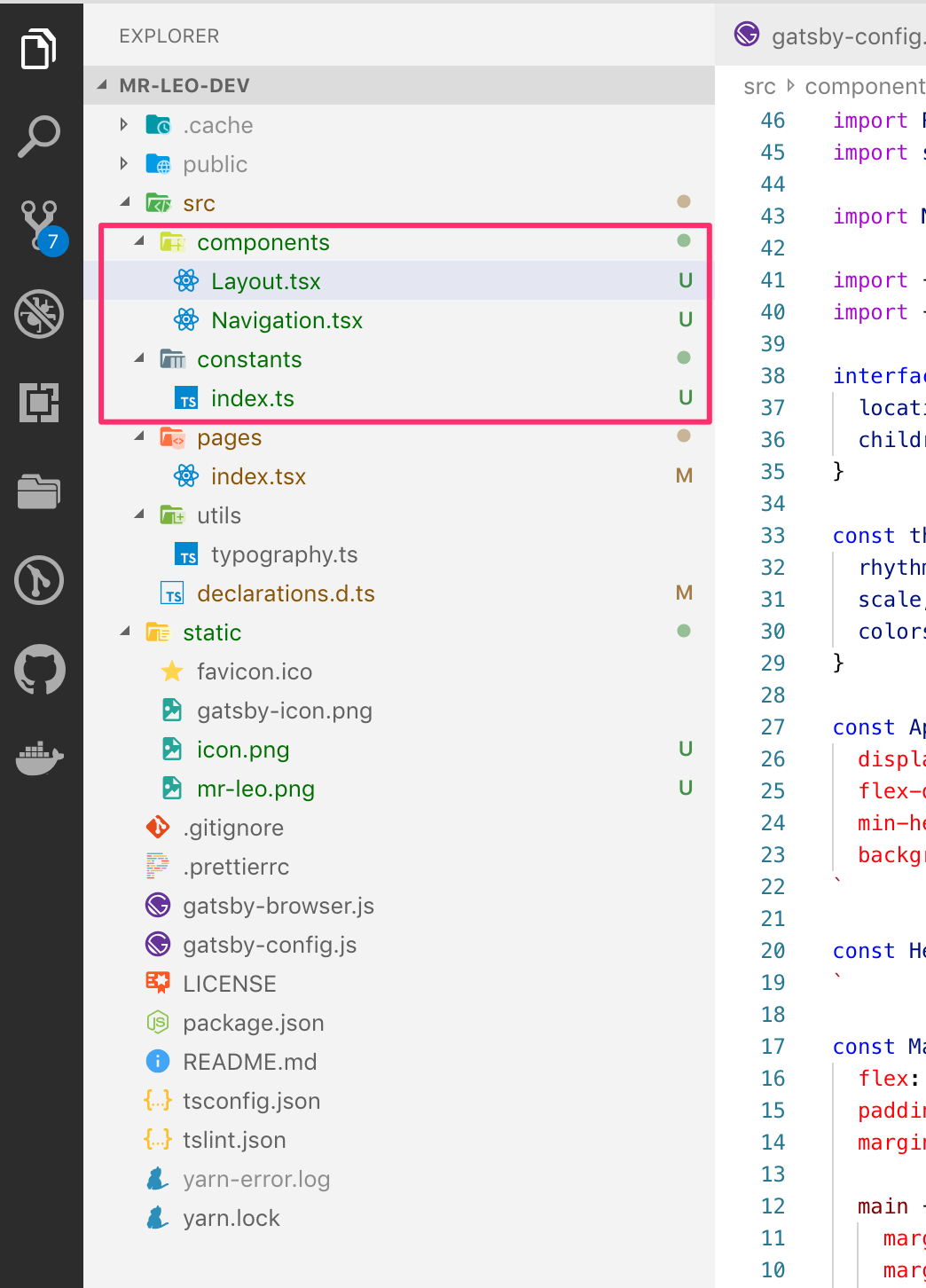
Let’s take a look at our structure project now:
Normally our blog will be contained inside a layout. That’s why we create a Layout.tsx component here:
import React from 'react'
import styled, { ThemeProvider } from 'styled-components'

import Navigation from '@components/Navigation'

import { rhythm, scale } from '@utils/typography'
import { colors } from '@constants/index'

interface ILayout {
  location: ILocation
  children: any
}

const theme = {
  rhythm,
  scale,
  colors,
}

const AppContainer = styled.div`
  display: flex;
  flex-direction: column;
  min-height: 100vh;
  background: ${props => props.theme.colors.mainBackground};
`

const HeaderContainer = styled.div`
`

const MainContainer = styled.div`
  flex: 1;
  padding: 0;
  margin-top: ${props => props.theme.rhythm(1.25)};

  main {
    margin-left: auto;
    margin-right: auto;
    max-width: ${props => props.theme.rhythm(40)};
    padding: 0 ${props => props.theme.rhythm(0.5)};
  }
`

class Layout extends React.Component<ILayout, {}> {
  render() {
    const { children } = this.props

    return (
      <ThemeProvider theme={theme}>
        <AppContainer>
          <HeaderContainer>
            <Navigation />
          </HeaderContainer>
          <MainContainer>
            <main>{children}</main>
          </MainContainer>
        </AppContainer>
      </ThemeProvider>
    )
  }
}

export default Layout
Thank for ThemeProvidersupported from styled-components we can inject some pre-defined properties such as colors, rhythm, scale to the whole application. So that we can use them easily when styling with styled-components such as:
max-width: ${props => props.theme.rhythm(40)};Next, we’ll take a look at Navigation.tsx component:
import React from 'react'
import styled from 'styled-components'
import { Link } from 'gatsby'

import { routeConstants } from '@constants/index'
import logo from '../../static/mr-leo.png'

const StyledContainer = styled.div`
  margin-left: auto;
  margin-right: auto;
  max-width: ${props => props.theme.rhythm(40)};
  padding: 0 ${props => props.theme.rhythm(0.5)};

  .inner-container {
    border-bottom: 1px solid rgba(0, 0, 0, .1);
    padding: ${props => props.theme.rhythm(0.75)} 0;
  }

  a {
    text-decoration: none;
    background-image: none;
    text-shadow: none;
  }

  img {
    margin-bottom: 0;
  }

  .logo {
    display: flex;
    align-items: center;
    height: ${props => props.theme.rhythm(2.5)};
  }
`

const Navigation = () => (
  <StyledContainer>
    <div className="inner-container">
      <Link to={routeConstants.home.path} className="logo">
        <img src={logo} alt="Logo" width="198" height="76" />
      </Link>
    </div>
  </StyledContainer>
)

export default Navigation
Nothing special except this line
import logo from '../../static/mr-leo.png'We will get an error from typescript that can’t understand .png extension file. Solving this issue is quite easy by adding that type to declarations.d.ts:
declare module 'typography-theme-github'

// And to shim assets, use (one file extension per `declare`):
declare module '*.png'
declare module '*.jpg'
declare module '*.jpeg'

interface ILocation {
  host: string
  hostname: string
  href: string
  key: string
  origin: string
  pathname: string
  port: string
}
Note: Here we also define global type for location property because we’ll use it many places in our project.
Another thing special in Navigation.tsx file is:
import { Link } from 'gatsby'For internal navigation, Gatsby includes a built-in <Link> component. One of the powerful of Gatsby’s <Link> is preloading feature. It means that resources are fetched by the time the user navigates to one component. I strongly recommend the official document here for more details.
We use one file named constants/index.ts to contains all constants will be used in our app:
export const colors = {
primary: '#222',
secondary: '#F7D02D',
mainBackground: '#FFFFFF',
gray500: '#757575',
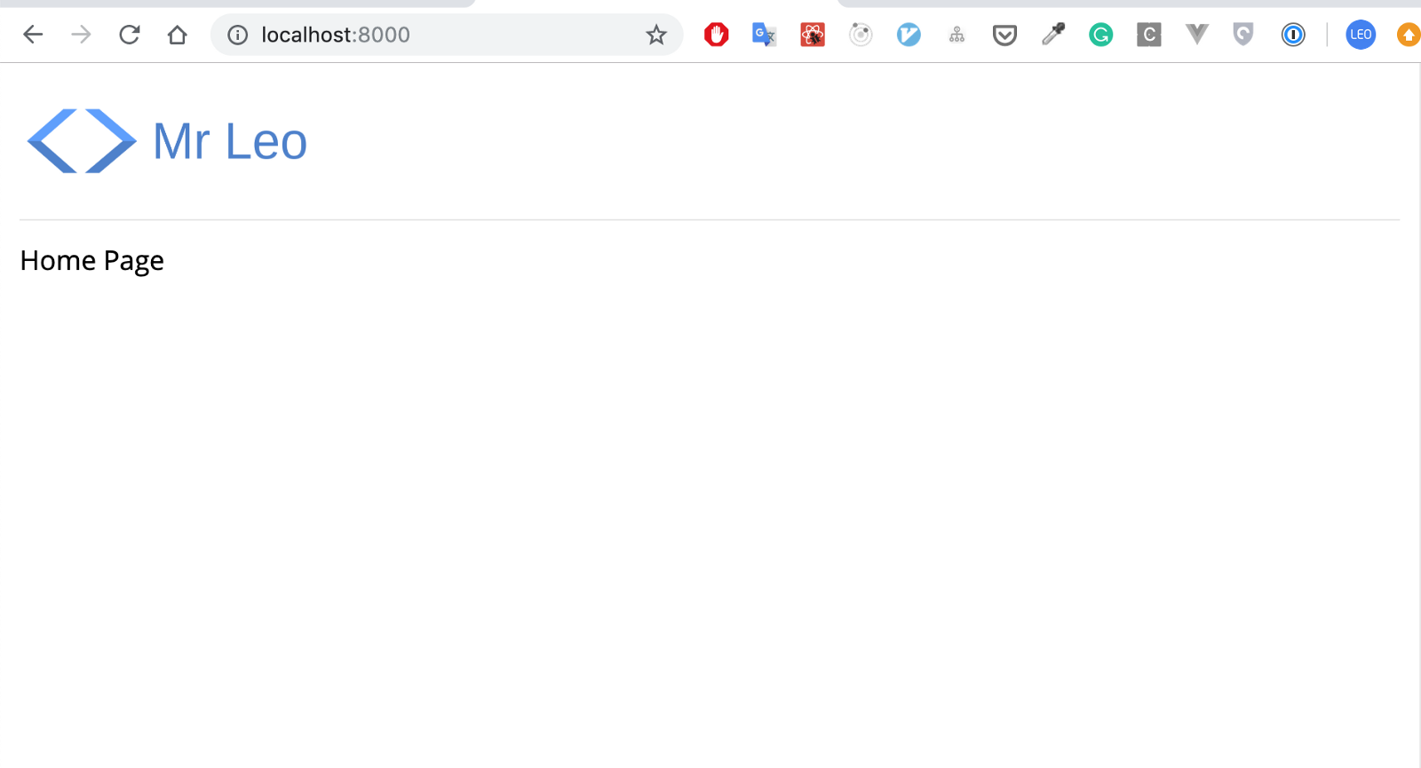
}Here is the result after all:
This one is just a dummy React element with mocked data:
import React from 'react'
import styled from 'styled-components'
import { Link } from 'gatsby'

import exampleImage from '../../static/featured-example.png'

const StyledContainer = styled.div`
  article {
    display: flex;

    .thumb {
      width: 66.66%;
      padding-right: ${props => props.theme.rhythm(0.5)};

      img {
        height: ${props => props.theme.rhythm(13)};
        width: 100%;
      }
    }

    .content {
      width: 33.34%;
      padding: 0 ${props => props.theme.rhythm(0.5)};
    }

    .description, .info {
      color: ${props => props.theme.colors.gray500};
    }
  }

  a {
    text-shadow: none;
    background-image: none;
  }

  @media only screen and (max-width: 767px) {
    article {
      display: block;

      .thumb {
        width: 100%;
        padding-right: 0;

        img {
          height: ${props => props.theme.rhythm(7)};
          width: 100%;
        }
      }

      .content {
        width: 100%;
        padding: 0;
      }
    }
  }
`

const FeaturedPost = () => {
  const title = 'Convert flowed-project to Typescript'
  const slug = 'convert-flowed-project-to-typescript'
  const heroImage = exampleImage
  const publishDate = 'Jan 23, 2018'
  const description = "First, I do not recommend everyone to move to TypeScript. Who's being happy with Flow, it’s fine"

  return (
    <StyledContainer>
      <Link to={`/${slug}`}>
        <article>
          <div className="thumb">
            <img src={heroImage} alt="" />
          </div>
          <div className="content">
            <h3>{title}</h3>
            <p className="description">{description}</p>
            <div className="info">{publishDate}</div>
          </div>
        </article>
      </Link>
    </StyledContainer>
  )
}

export default FeaturedPost
For the heroImage we’re using normal img html tag. We’ll optimize image loading & performance later thank for Gatsby plugin support gatsby-image. Right now just keep it simple like that.
Adding to our home page component src/pages/index.tsx:
import React from 'react'
import styled from 'styled-components'
import Layout from '@components/Layout'
import FeaturedPost from '@components/FeaturedPost'
interface IProps {
location: ILocation
}
const StyledContainer = styled.div`
`
class HomePage extends React.Component<IProps, {}> {
render() {
return (
<Layout location={this.props.location}>
<StyledContainer>
<FeaturedPost />
</StyledContainer>
</Layout>
)
}
}
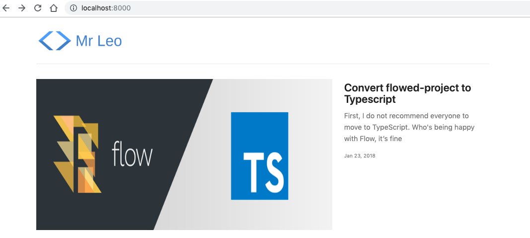
export default HomePageResult:
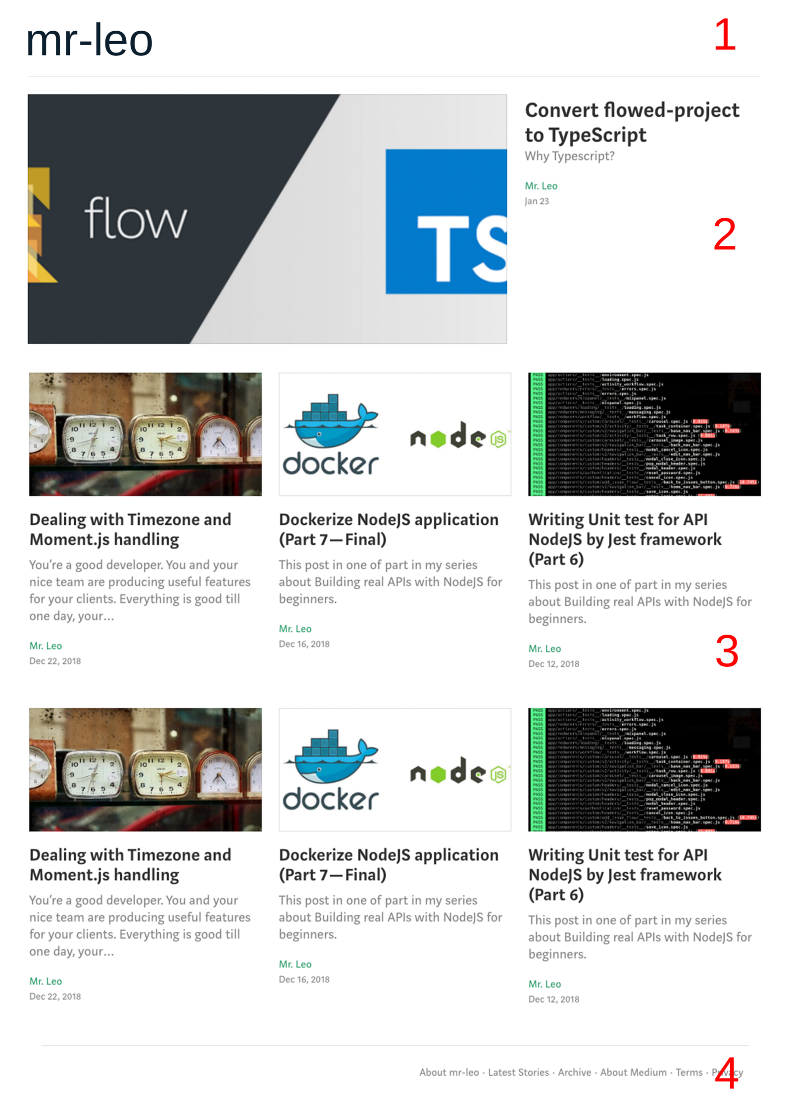
Recent posts section lists all posts we’ll create and sorted by published date by default.
Create a ThumbnailPost.tsx file:
import React from 'react'
import styled from 'styled-components'
import { Link } from 'gatsby'

interface IProps {
  title: string
  slug: string
  publishedDate: string
  description: string
  heroImage: string
}

const StyledContainer = styled.div`
  width: 33.3333%;

  article {
    padding-right: ${props => props.theme.rhythm(1)};

    .thumb {
      img {
        height: ${props => props.theme.rhythm(8)};
        border: 1px solid rgba(0, 0, 0, .15);
        width: 100%;
      }
    }

    .content {
      padding: 0 ${props => props.theme.rhythm(0.5)} 0 0;
    }

    .description, .info {
      color: ${props => props.theme.colors.gray500};
    }

    .info {
      ${props => ({ ...props.theme.scale(-0.5) })}
    }
  }

  a {
    text-shadow: none;
    background-image: none;
  }

  @media only screen and (max-width: 767px) {
    width: 100%;

    article {
      display: block;
      padding-right: 0;

      .thumb {
        width: 100%;
        padding-right: 0;

        img {
          height: ${props => props.theme.rhythm(7)};
          width: 100%;
        }
      }

      .content {
        width: 100%;
        padding: 0;
        margin-bottom: ${props => props.theme.rhythm(1.25)};
      }
    }
  }
`

const ThumbnailPost = (props: IProps) => {
  const {
    slug,
    heroImage,
    title,
    description,
    publishedDate,
  } = props

  return (
    <StyledContainer>
      <article>
        <Link to={`/${slug}`}>
          <div className="thumb">
            <img src={heroImage} alt="" />
          </div>
          <div className="content">
            <h2>{title}</h2>
            <p className="description">{description}</p>
            <div className="info">{publishedDate}</div>
          </div>
        </Link>
      </article>
    </StyledContainer>
  )
}

export default ThumbnailPost
Now in the home page component we need to adapt the code a little bit to show recent posts section:
import React from 'react'
import styled from 'styled-components'

import Layout from '@components/Layout'
import FeaturedPost from '@components/FeaturedPost'
import ThumbnailPost from '@components/ThumbnailPost'

import exampleImage1 from '../../static/example-1.jpeg'
import exampleImage2 from '../../static/example-2.png'
import exampleImage3 from '../../static/example-3.png'

interface IProps {
  location: ILocation
}

interface IPost {
  title: string
  slug: string
  publishedDate: string
  description: string
  heroImage: string
}

const StyledContainer = styled.div`
  .thumbnail-post-container {
    display: flex;
    margin-bottom: ${props => props.theme.rhythm(1.25)};
  }

  @media only screen and (max-width: 767px) {
    .thumbnail-post-container {
      display: block;
    }
  }
`

class HomePage extends React.Component<IProps, {}> {
  render() {
    const recentPosts = [
      {
        title: 'Dealing with Timezone and Moment.js handling',
        slug: 'dealing-with-timezone-and-moment-handling',
        publishedDate: 'Dec 22, 2018',
        description: "You’re a good developer. You and your nice team are producing useful features for your clients.",
        heroImage: exampleImage1,
      },
      {
        title: 'Dockerize NodeJS application (Part 7 — Final)',
        slug: 'dockerize-nodejs-application-part-7-final',
        publishedDate: 'Dec 16, 2018',
        description: "This post in one of part in my series about Building real APIs with NodeJS for beginners. All main contents in this series in case we want to navigate quickly.",
        heroImage: exampleImage2,
      },
      {
        title: 'Writing Unit test for API NodeJS by Jest framework (Part 6)',
        slug: 'writing-unit-test-for-api-nodejs-by-jest-framework-part-6',
        publishedDate: 'Dec 12, 2018',
        description: "When I investigated how to write unit tests for API in NodeJS, most of the articles I found that mention how to implement with Mocha, Chai, istanbul, etc…",
        heroImage: exampleImage3,
      }
    ]

    return (
      <Layout location={this.props.location}>
        <StyledContainer>
          <FeaturedPost />
          <div className="thumbnail-post-container">
            {recentPosts.map((post: IPost) => (
              <ThumbnailPost
                title={post.title}
                slug={post.slug}
                publishedDate={post.publishedDate}
                description={post.description}
                heroImage={post.heroImage}
              />
            ))}
          </div>
        </StyledContainer>
      </Layout>
    )
  }
}

export default HomePage
Here is the result:

The footer of our blog is a very simple component. Right now we just put some content link to our home page:
import React from 'react'
import styled from 'styled-components'
import { Link } from 'gatsby'
import { routeConstants } from '@constants/index'
const StyledContainer = styled.footer`
margin-left: auto;
margin-right: auto;
max-width: ${props => props.theme.rhythm(40)};
padding: 0 ${props => props.theme.rhythm(0.5)};
.inner-container {
padding: ${props => props.theme.rhythm(1.25)} 0;
border-top: 1px solid rgba(0, 0, 0, .1);
}
.menu {
text-align: right;
}
.item {
color: ${props => props.theme.colors.gray500};
&:first-child {
margin-left: ${props => props.theme.rhythm(1.25)};
}
}
.dot-divider {
color: ${props => props.theme.colors.gray500};
padding: 0 ${props => props.theme.rhythm(0.25)};
}
@media only screen and (max-width: 767px) {
.menu {
display: flex;
flex-direction: column;
text-align: left;
}
.item {
&:first-child {
margin-left: 0;
}
line-height: ${props => props.theme.rhythm(1.55)};
}
.dot-divider {
display: none;
}
}
`
const Footer = () => (
<StyledContainer>
<div className="inner-container">
<div className="menu">
<Link to={routeConstants.home.path} className="item">
About Mr Leo
</Link>
<span className="dot-divider">·</span>
<Link to={routeConstants.home.path} className="item">
Latest Stories
</Link>
<span className="dot-divider">·</span>
<Link to={routeConstants.home.path} className="item">
Contact
</Link>
</div>
</div>
</StyledContainer>
)
export default Footer
So far so good. Now we already have a looking good home page for our blog. If you already familiar with React so working with Gatsby is easy, right? Almost everything we have done so far in this part is dummy React components along with styled-components css.
Next part is an interested one. We’ll work with backend/cms headless framework to manage and produce data for our blog. Besides, we’ll get acquainted with Graphql basic to query our data. See you there!


